HTML Email Coding: How to Code Emails from Scratch
Modern HTML email coding requires specialized skills that differ vastly from standard web design. Email clients like Gmail, Outlook, and Apple Mail process code differently, forcing developers to rely on table layout structures and CSS inline styling. Professional email development prioritizes inbox compatibility, mobile responsiveness, and clean rendering over modern CSS frameworks.
To build successful campaigns, developers must balance lightweight email HTML, accessibility, and responsive code while avoiding techniques that break visual layouts across diverse inbox platforms.
Why HTML Email Coding Is Completely Different From Website Development
Website developers often expect email HTML to behave like browser HTML. That expectation creates broken columns, missing styles, stretched images, dark mode issues, and Outlook spacing problems.
Email clients use different rendering engines and security rules. This means professional HTML email coding starts with compatibility, not design freedom.
Email Clients Do Not Render Code Like Browsers
Web browsers use standardized engines to read code, but email clients use entirely different rendering rules. Developers must adjust their strategies to accommodate platforms that ignore modern coding standards.
Understanding these differences prevents broken layouts. The most common client behaviors include:
- Gmail limitations: Strips out classes and IDs from the head section in specific versions.
- Apple Mail advantages: Supports modern WebKit features better than most competitors.
- Yahoo Mail quirks: Requires specific media queries to trigger mobile layouts correctly.
Modern CSS Support Is Still Extremely Limited in Emails
Modern website design uses flexbox, grid, external stylesheets, JavaScript, animations, sticky positioning, and advanced selectors. Email clients support these features unevenly.
Campaign Monitor’s email CSS support guide shows CSS support varies across mobile, desktop, and webmail clients, which makes compatibility testing essential before sending campaigns.
Developers should treat modern CSS carefully in emails because support differs by inbox:
- Flexbox: Some clients support it, but not all rendering environments handle it reliably.
- CSS Grid: Many email clients still lack dependable support.
- External CSS: Several clients strip or ignore linked stylesheets.
- Animations: Support varies and can fail silently.
- Advanced selectors: Many inboxes ignore complex selector logic.
A safe email build uses simple, tested techniques first.
The Core Structure Every HTML Email Must Follow
Why Table Layout Is Still the Industry Standard
Standard div tags collapse or stack incorrectly inside email clients. A proper table layout forces content to remain exactly where you place it.
Using tables acts as a universal safety net for your designs. The benefits of this structure include:
- Predictable widths: Lock your content into fixed dimensions across all platforms.
- Controlled spacing: Prevent unwanted margins from ruining your visual hierarchy.
- Cross-client safety: Ensure older software displays your layout accurately.
The Basic Anatomy of an HTML Email
A complete email needs a predictable structure. Each section should support one job in the message.
The basic anatomy usually includes:
- Wrapper table: Creates the full-width background and centers the content.
- Container table: Holds the main content, often around 600px wide.
- Header: Includes logo, brand line, or simple navigation.
- Body: Contains the main message, images, and supporting copy.
- CTA section: Gives the reader one clear action.
- Footer: Includes unsubscribe text, address, preferences, and legal details.
This structure keeps the email easy to scan and easier to code.
Proper Width Structure for Email Compatibility
Many email developers use a 600px container because it fits most desktop inboxes and scales well on mobile. Some brands use 640px or 700px, but 600px remains a safe default.
The mobile version should stack or shrink content naturally. A fixed desktop design without responsive planning often creates horizontal scrolling on phones.
Why Nested Tables Improve Rendering Stability
Nested tables help isolate layout blocks. If one section needs two columns, the developer can place a separate inner table inside the main container. This reduces the chance that one layout problem breaks the full email.
Nested tables work best when you keep them clean, label sections clearly, and avoid unnecessary depth.
CSS Inline Styling: The Most Important Rule in HTML Email Coding
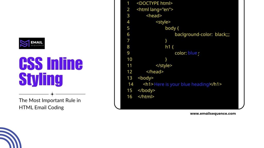
CSS inline styling improves rendering consistency because many email clients handle styles better when they sit directly on HTML elements.
Email CSS works differently from website CSS. A normal stylesheet-based workflow can fail inside inboxes.
Why External Stylesheets Fail in Emails
Many clients strip the entire head section from your email HTML. This security measure deletes all your linked or embedded stylesheets instantly.
Applying styles directly to elements bypasses this aggressive filtering. You secure your design by:
- Removing link tags: Stop relying on external CSS files completely.
- Avoiding global classes: Prevent webmail clients from overwriting your styles.
- Using inline attributes: Force the client to read the style exactly where the element exists.
Why Inline CSS Improves Email Compatibility
Inline CSS places the style directly on each element. This increases the chance that Gmail, Outlook, Yahoo, and other clients display the email as intended.
For example, a paragraph should include its font family, size, line height, color, and margin style inline when those values matter.
The Most Important Inline Styles Every Email Needs
Important styles should appear directly on the HTML elements because inboxes may not preserve global CSS. This makes the email more durable.
Developers should inline the core visual rules first.
Common inline styles include:
- Font styling: Font family, size, line height, and color.
- Padding: Spacing inside table cells.
- Background colors: Section and button backgrounds.
- Text alignment: Left, center, or right alignment.
- Button styling: Padding, border radius, color, and font weight.
Inlining these values reduces surprise rendering differences.
Building Responsive Code for Mobile Email Optimization
Mobile email design matters because many users read campaigns from phones. Small text, tiny CTA buttons, and broken columns can reduce clicks quickly.
Responsive email development should start before writing code, not after the design breaks.
Why Mobile Optimization Is No Longer Optional
Mobile users scan quickly. They expect readable text, clear spacing, and CTA buttons that they can tap easily.
Litmus tracks email client market share and shows major inbox environments like Apple Mail, Gmail, Outlook, and Yahoo continue to dominate email opens, which makes multi-client and device testing important for any serious campaign.
A mobile-first email should protect readability, spacing, and tap targets.
Responsive Code Techniques That Actually Work in Emails
Media queries allow you to change styles based on the device screen size. You combine these queries with fluid widths to create adaptable layouts.
Fluid and hybrid techniques form the backbone of mobile emails. You build responsive structures by:
- Targeting max-width: Use media queries to apply mobile styles under 480 pixels.
- Using percentages: Change fixed pixel widths to 100% inside your mobile styles.
- Hiding elements: Use CSS display properties to remove non-essential desktop graphics on mobile.
The Best Mobile Width and Font Practices
Mobile emails need comfortable reading. Body text usually works best at 15px to 16px or larger, with generous line height.
CTA buttons should feel easy to tap. A button that looks fine on desktop may feel too small on a phone.
Common Mobile Rendering Problems in HTML Emails
Mobile problems usually come from a desktop-first design. A wide image, multi-column layout, or tiny font can break the mobile experience.
Common issues include:
- Text scaling: Some clients enlarge or shrink text unexpectedly.
- Broken columns: Side-by-side sections do not stack properly.
- Tiny buttons: CTAs become hard to tap.
- Overflow: Fixed-width content creates horizontal scrolling.
- Image cropping: Large images do not resize properly.
Testing catches these issues before subscribers see them.
Step-by-Step Workflow to Code an HTML Email From Scratch
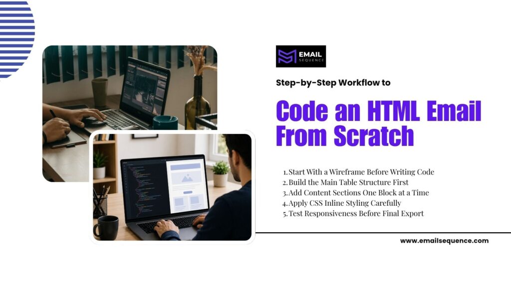
Start With a Wireframe Before Writing Code
Planning your layout visually prevents structural errors during the coding phase. You must map out every column, image, and text block before opening your code editor.
A strong wireframe dictates the exact table structure you need. You prepare effectively by:
- Mapping rows: Identify exactly how many primary table rows your design requires.
- Defining columns: Note which sections require nested tables for side-by-side content.
- Sizing assets: Determine the exact pixel dimensions needed for every image export.
Build the Main Table Structure First
You must create the skeleton of your email before adding any actual content. Code the 100% wrapper table and the 600px container table to establish your boundaries.
Establishing the foundation prevents alignment bugs later. You construct the base by:
- Setting defaults: Apply border=”0″ cellpadding=”0″ cellspacing=”0″ to all tables.
- Centering content: Use align=”center” on your main container table.
- Applying backgrounds: Add your primary body background color to the wrapper table.
Add Content Sections One Block at a Time
Developing modular sections allows you to isolate and fix bugs easily. You insert your header, main image, body copy, and footer step by step.
Working modularly keeps your code clean and organized. You build sections smoothly by:
- Testing individually: Check each table row in a browser before moving to the next.
- Nesting accurately: Place sub-tables carefully inside the primary row data cells.
- Inserting placeholders: Use dummy text and placeholder images to verify structural alignment.
Apply CSS Inline Styling Carefully
Apply inline styles after the content structure works. Keep styles consistent across headings, paragraphs, buttons, and sections.
Use a CSS inliner if you write styles in the head during development.
Test Responsiveness Before Final Export
You must trigger your media queries and review the mobile layout before loading the code into your sending platform. Resize your browser window to simulate mobile devices.
Catching responsive failures early saves your campaign from disaster. You verify mobile performance by:
- Checking column stacks: Ensure left-aligned columns drop neatly below right-aligned columns.
- Verifying image scaling: Confirm no images push the table width past the screen edge.
- Validating button sizes: Test that CTAs expand correctly for easy mobile tapping.
Email Development Testing: What Professionals Always Check Before Sending
Cross-Client Rendering Tests
Test Gmail, Outlook, Yahoo, Apple Mail, and mobile apps. Each client can handle spacing, images, fonts, and CSS differently.
Tools like Litmus and Email on Acid help teams preview emails across clients.
Mobile Responsiveness Testing
Check common phone sizes and inbox apps. Look for readable text, correct image scaling, and tap-friendly buttons.
Mobile testing should happen before final approval.
Spam and Deliverability Checks
HTML quality affects deliverability indirectly. Broken code, image-only emails, missing unsubscribe links, and suspicious links can hurt campaign performance.
Spam checks help catch issues before launch.
Link and CTA Validation
A beautiful email fails completely if the primary button links to a broken page. Professionals manually click every single link in the test email to confirm tracking parameters work.
Functional testing secures your campaign ROI. You execute this check by:
- Clicking the hero image: Ensure the main graphic directs to the landing page.
- Testing the button: Verify the CTA URL includes correct UTM tracking parameters.
- Checking the footer: Confirm unsubscribe and privacy policy links function legally.
HTML Emails vs Drag-and-Drop Builders: Which Is Better?
Choosing between manual coding and automated builders impacts your campaign flexibility significantly. Read the table below to understand which approach fits your workflow.
| Feature Comparison | Manual HTML Email Coding | Drag-and-Drop Builders | Best For Complex Layouts | Best For Fast Execution |
| Customization | Unlimited creative freedom | Restricted to template limits | HTML Coding | Drag-and-Drop |
| Code Quality | Clean, optimized file size | Heavy, bloated auto-code | HTML Coding | Drag-and-Drop |
| Responsiveness | Advanced breakpoint control | Basic mobile stacking only | HTML Coding | Drag-and-Drop |
| Production Speed | Requires extensive time | Built in minutes | HTML Coding | Drag-and-Drop |
| Interactivity | Supports hover and dark mode | Rarely supports advanced CSS | HTML Coding | Drag-and-Drop |
Conclusion
Professional HTML email coding requires compatibility-focused development instead of normal website coding habits. Email clients render HTML and CSS differently, so developers must use stable email HTML structure, reliable table layout, careful CSS inline styling, and tested responsive code.
Successful email development depends on simplicity, accessibility, mobile optimization, image performance, cross-client testing, and dark mode awareness.
This technical foundation, paired with expertly crafted copywriting, allows you to launch strategic email campaigns that resonate with your audience and drive results. For services like email sequence copywriting, AI email campaigns, or white-label cold email, contact emailsequence.com.
Frequently Asked Questions
What is HTML email coding?
HTML email coding means building email templates with HTML and CSS that render inside inboxes like Gmail, Outlook, Apple Mail, and Yahoo. It differs from website coding because email clients support HTML and CSS unevenly. Developers often use table layout, inline CSS, optimized images, and cross-client testing to create stable email designs.
Why do HTML emails use table layout?
HTML emails use table layout because tables render more consistently across email clients than modern CSS layout systems. Outlook and other clients may break div-based layouts, flexbox, or grid. Tables help developers control width, spacing, columns, and alignment with fewer rendering surprises across desktop, webmail, and mobile inboxes.
Why is CSS inline important in emails?
CSS inline styling places visual rules directly on HTML elements. This improves compatibility because some email clients strip external stylesheets or ignore head styles. Inline CSS helps preserve fonts, colors, padding, alignment, and button styling across more inboxes. Developers can use inlining tools to speed up this process.
How do I make HTML emails responsive?
Use fluid tables, percentage-based widths, media queries where supported, stackable columns, flexible images, and mobile-friendly font sizes. Strong responsive code should not depend only on media queries because some clients handle them inconsistently. Always test the email across mobile inboxes before sending.
What tools help with HTML email development?
Useful tools include Litmus, Email on Acid, MJML, Foundation for Emails, CSS inliners, and code editors like VS Code. MJML helps developers write responsive emails faster, while testing platforms preview rendering across inboxes. These tools support better email development, but manual QA still matters.
Why do HTML emails break in Outlook?
Outlook often breaks emails because many desktop versions use Word-style rendering behavior instead of normal browser rendering. This can affect spacing, backgrounds, widths, buttons, and CSS support.