5 Easy Email UX Fixes That Boost Conversions by 15%

Is your high email open rate a false victory? Many email marketers obsess over those numbers, meticulously A/B testing subject lines and perfecting send times. They celebrate every percentage point climbed. But here’s the uncomfortable truth: getting someone to open your email is only half the battle.
The real conversion killer happens after the open. Poor user experience destroys click-through rates faster than any spam filter ever could. Your subscribers opened your email with intent, but confusing layouts, tiny buttons, and overwhelming choices send them straight to the delete button.
Good email UX is not about flashy graphics or complex animations. It is about eliminating friction, reducing cognitive load, and preventing physical tapping errors to guide readers seamlessly to your call-to-action. The difference between a 2% click-through rate and a 15% rate often comes down to simple, fixable UX problems.
In this blog post, we will share five practical fixes you can implement today without redesigning your entire email template. Each fix addresses a specific friction point that keeps your subscribers from converting. Apply them systematically, and you will see your click-through rates climb by 15% or more within your next campaign.
Fix 1: The Single-Focus Rule (Reduce Cognitive Load)
When faced with multiple options, people often choose none at all. This psychological phenomenon, called analysis paralysis, destroys email conversions. Your subscribers receive hundreds of emails weekly. They scan, decide, and act within seconds. Multiple competing calls-to-action force them to think, and thinking kills momentum.
Primary Action Check
Every email must have one primary objective. Secondary elements like social media icons, footer links, or additional offers should exist but remain visually subordinate to your main CTA. This creates a clear hierarchy that guides the eye naturally.
Use a single, bold, primary CTA button positioned prominently in your email design. Make it larger, brighter, and more visually striking than any other clickable element. Your secondary links should use smaller fonts, muted colors, or simple text formatting.
Scannability (5-Second Test)
- Subscribers decide whether to engage with your email in under five seconds.
- If your message and required action aren’t immediately clear, they’ll move on.
- Keep body paragraphs to a maximum of three sentences.
- Use bullet points for dense information.
- Write scannable headlines that instantly communicate value.
- Your email should pass the five-second test: a new reader should grasp the offer and the next step within that timeframe.
Fix 2: The Finger-Friendly CTA (Optimizing the Tap)
A crucial part of good email UX is designing for mobile. Over 60% of emails are opened on mobile devices, yet many still feature desktop-sized buttons and links. Tiny, crowded clickable areas create frustration and abandonment. When users cannot tap accurately on their first attempt, they rarely try again.
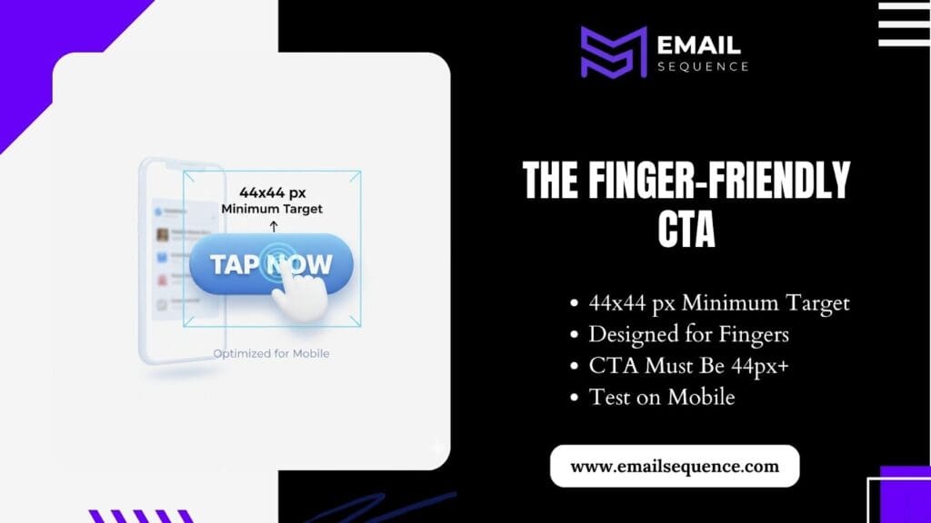
Tappable Zone (The 44×44 Rule)
- Apple’s Human Interface Guidelines recommend a minimum target size of 44×44 pixels for any interactive element.
- This accounts for average finger size and natural tapping variations. Smaller targets require precision that mobile users will not provide.
- Ensure your primary CTA button, including padding and border, meets this 44-pixel minimum height requirement.
- Test this on actual devices, not just desktop previews. Your button should be easily tappable even when held one-handed or used with a thumb.
Contrast and Placement
Visual hierarchy determines where users look first. Your CTA button must stand out immediately against your email background and surrounding content. Low contrast forces users to search for the action, creating unnecessary cognitive load.
- Use high-contrast color combinations for your primary button. A bright blue button against a white background, or white text on a dark button, creates instant visibility. Avoid similar colors that blend together or require close examination.
- Write action-oriented, benefit-driven CTA text that tells users exactly what they will receive. “Get My Free Template” outperforms “Click Here” because it communicates value and action simultaneously. Generic text like “Learn More” provides no compelling reason to click.
- Place your primary CTA above the fold on mobile devices. Most subscribers will not scroll past the first screen unless the visible content strongly compels them. Your most important action should be immediately visible without any scrolling required.
Fix 3: Master Mobile Layout & Accessibility
Desktop-optimized emails often become unreadable on mobile screens, leading to poor Email UX. Complex layouts that look sophisticated on large monitors create horizontal scrolling, tiny text, and broken formatting on smartphones.
The Single-Column Mandate
Multi-column layouts work acceptably on desktop but create chaos on mobile screens. Side-by-side content blocks shrink to unreadable sizes or force horizontal scrolling. Both outcomes destroy user experience and increase abandonment rates.
- Design all main content blocks using 100% width, single-column layouts that stack vertically on mobile devices.
- Your email template should automatically reformat multi-column desktop content into a single, scrollable mobile column.
- Test this on actual mobile devices, not just responsive preview tools.
Text Readability and Contrast
Small text forces users to pinch and zoom, destroying the seamless experience you want to create. If subscribers must manipulate their device to read your content, they will often abandon the email instead.
Set your body text to a minimum of 16 pixels on mobile devices. This ensures readability without zooming across all common screen sizes and device types. Use fonts that remain clear and legible at smaller sizes, avoiding decorative or thin fonts that become illegible on mobile.
Fix 4: Optimize Image Load and Fallback
Large, unoptimized images slow email loading and create poor user experiences. Many email clients block images by default, making alt text your only communication method. Both scenarios can destroy your message effectiveness if handled poorly.
Speed is UX
Email loading speed directly impacts engagement rates. Subscribers will not wait for slow-loading emails when their inbox contains dozens of alternatives. Heavy images and oversized files create delays that lead to immediate abandonment.
Compress all images to keep your total email file size under 100KB whenever possible. Large product photos, hero images, and graphics should be optimized specifically for email delivery, not web display.
The Alt Text Lifeline
- Images often fail to load, especially in Outlook and corporate email systems. When this happens, alt text becomes your primary communication tool.
- Avoid generic alt text like “image” or “photo,” as this provides no value to the reader.
- Write descriptive, actionable alt text for every image, particularly those with important information or calls-to-action (CTAs).
- Ensure alt text for CTA buttons communicates the action, making your message clear even when images are blocked.
Fix 5: The Trust & Exit Experience
User experience extends beyond your email content. The moment after clicking your CTA and the process for managing email preferences both impact subscriber trust and long-term engagement. Poor post-click experiences destroy the goodwill created by effective email design.
Post-Click Consistency
Clicking your email CTA should feel like a natural continuation of the same experience, not a jarring transition to unrelated content. Mismatched landing pages create confusion and increase bounce rates, wasting your email marketing efforts.
- Ensure your landing page headline, offer, and visual design align perfectly with your email content.
- If your email promotes a “Free Marketing Template,” the landing page should immediately display that exact template with consistent branding and messaging.
- Subscribers should instantly recognize they are in the correct location.
The Unsubscribe UX
Making unsubscribe links difficult to find leads to spam complaints, which damage your sender reputation and email deliverability. Paradoxically, making it easy to leave often keeps subscribers engaged by giving them control over their experience.
- Instead of hiding unsubscribe options, provide clear preference management.
- Use “Manage Email Preferences” links that allow subscribers to reduce frequency, change topics, or pause emails temporarily rather than leaving entirely.
- This approach retains subscribers who might return later while respecting their current preferences.
Conclusion
Effective email UX transforms opens into revenue by removing the barriers between subscriber interest and action. These five fixes address the most common friction points that prevent conversions, regardless of your industry or email frequency.
Start with these three immediate changes that deliver the highest impact with minimal effort. First, implement the single-focus rule by identifying and strengthening one primary CTA while de-emphasizing secondary links.
Second, ensure your main CTA button meets the 44-pixel minimum tappable area requirement on mobile devices. Third, compress all images to keep your total email size under 100KB for faster loading.
Ready to systematically apply these fixes and create consistently high-performing emails that convert subscribers into customers? Explore advanced strategies and tools on our email sequence website today!
Frequently Asked Questions
What does Email UX mean?
Email UX (User Experience) refers to how easily and intuitively a reader can interact with and act on your email. It focuses on layout, readability, accessibility, and how effectively the design guides users toward your main goal, clicking the call-to-action (CTA).
What is the “Single-Focus Rule” in email design?
The Single-Focus Rule means your email should have one primary goal. Avoid multiple CTAs that confuse readers. A single, bold, and clear CTA helps subscribers focus on the desired action, improving conversions.
How can I make my emails load faster?
Compress all images, keep the total file size under 100KB, and minimize unnecessary graphics. Faster-loading emails reduce abandonment and keep users focused on your message and CTA.
What is alt text, and why is it important?
Alt text is descriptive text shown when images don’t load. It ensures your message is still communicated, improves accessibility, and maintains clarity even in image-blocked email clients.
What’s the best CTA placement in an email?
Place your primary CTA above the fold, where it’s immediately visible without scrolling. You can repeat it later in the email for reinforcement, but ensure the first one catches instant attention.