10% CTR Goal: Master High-Converting Email CTAs
Your email campaigns generate opens. People read your subject lines and click through to your message. But then what happens? If your subscribers are not clicking your call-to-action buttons, your entire email strategy is failing at the final step.
The click-through rate is the most important revenue metric. Open rates tell you if your subject line worked. Click-through rates indicate whether your email was effective.
Most marketers aim for a 2-3% click-through rate and consider that acceptable. But the real benchmark for high-performing email campaigns is 10% or higher. Getting there requires a scientific approach to crafting, designing, and testing your CTAs.
In this detailed blog post, we will discuss the three-pillar framework for crafting high-converting email CTAs: Psychology, Design, and Testing Architecture. By mastering these three key areas, you can turn your email campaigns from simple messages into powerful revenue-driving tools.
The Single Metric That Defines Your ROI
The CTR Imperative: Why CTR is the single most important metric, far above the open rate
Open rates measure curiosity. Click-through rates measure commitment.
An open rate tells you that someone was interested enough to read your subject line. A click-through rate tells you that someone was interested enough to take action. That action is what drives revenue. Without clicks, your email campaign produces no conversions, no sales, and no ROI.
- Many marketers celebrate a 25% open rate and overlook a 2% CTR. This is a fundamental mistake.
- A 25% open rate with a 2% CTR means that only 0.5% of your total list took action.
- A 15% open rate with a 10% CTR means that 1.5% of your list took action. The second campaign generates three times the results.
- CTR is the bridge between interest and revenue. If your CTR is low, your email strategy is broken at the most critical point.
The 10%+ Goal: Moving beyond basic examples to a scientific, sequence-level optimization framework
A 10% click-through rate is not just a number. It is a signal that your email resonates with your audience, your offer is compelling, and your CTA is clear and persuasive.
This is not guesswork. It’s a repeatable, scalable process for creating High-Converting Email CTAs, applicable to welcome sequences, abandoned cart reminders, promotional campaigns, and content newsletters.
The 3-Pillar Formula: Psychology, Design, and Testing Architecture
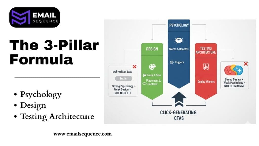
Three elements determine whether your CTA generates clicks or gets ignored:
- Psychology: The words you use, the benefits you promise, and the triggers you activate in your reader’s mind.
- Design: The visual presentation of your CTA, including color, size, placement, and contrast.
- Testing Architecture: The systematic process of experimenting with different CTA variations and deploying winners across your email sequences.
Each pillar is essential. Strong psychology with weak design results in a CTA that persuades but does not get noticed. Strong design with weak psychology results in a CTA that gets noticed but does not persuade.
Pillar 1: The Psychology of High-Impact Wording
Words drive clicks. The language you use in your CTA determines whether your reader feels compelled to act or ignores your button entirely.
The key to a successful CTA is focusing on the outcome, not the action. For instance, instead of “Download Now,” try “Unlock Your 7-Step Playbook.” The second option highlights what the reader gains, making it more compelling.
Psychology is the cornerstone of high-converting CTAs. Here are a few principles that can transform your copy from generic to irresistible:
- Focus on Value: Frame the CTA around the benefit for the user. What will they get by clicking?
- Create Urgency: Use words that encourage immediate action, like “Now” or “Today.”
- Inspire Curiosity: Hint at the valuable information behind the click to make users want to learn more.
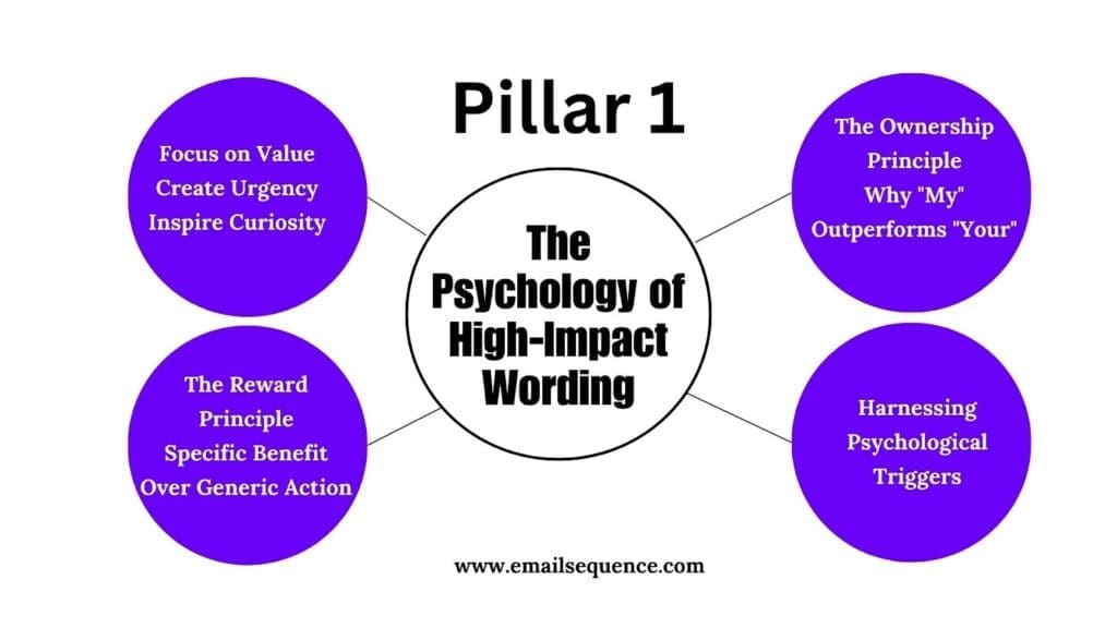
A. The Ownership Principle: Why “My” Outperforms “Your”
First-person language increases commitment. When a CTA says “Start My Free Trial,” the reader mentally owns the action before they click. When a CTA says “Start Your Free Trial,” the action feels distant and impersonal.
Examples of first-person CTAs:
- “Show Me The Deal” (instead of “See The Deal”)
- “Send Me The Guide” (instead of “Get The Guide”)
The ownership principle applies to nearly every CTA. To create High-Converting Email CTAs, test this change in your next campaign. Replace second-person language with first-person language and measure the difference in click-through rate.
B. The Reward Principle: Specific Benefit Over Generic Action
Generic CTAs describe what the reader will do. Specific CTAs describe what the reader will gain.
Compare these two CTAs:
- “Download”
- “Unlock The 7-Step Playbook”
The first version is passive and vague. The second version is active and specific. It tells the reader exactly what they will receive and implies that the content is valuable and exclusive..
How to apply the reward principle:
- Identify the benefit your reader will receive after clicking.
- Replace generic action words with outcome-focused language.
- Use numbers, adjectives, or exclusivity cues to make the benefit tangible.
Examples of reward-focused CTAs:
- “Download My Free Checklist” (instead of “Download”)
- “Unlock Insider Tips” (instead of “Learn More”)
- “Claim My 20% Discount” (instead of “Get Discount”)
The reward principle is especially powerful in lead generation and content promotion emails. Readers need to know what they are getting before they click.
C. Harnessing Psychological Triggers
Certain psychological triggers consistently increase click-through rates. These triggers tap into fundamental human motivations: fear of missing out, curiosity, and loss aversion.
How do you integrate psychological triggers into your CTAs without sounding manipulative? Use them strategically and ensure that your CTA aligns with the value you are offering. The following triggers are proven to drive clicks when used appropriately.
FOMO (Urgency & Scarcity):
Fear of Missing Out (FOMO) is the anxiety people feel when they believe they’re missing an opportunity or experience. It’s a powerful motivator that can drive quick decision-making.
Limited-time offers and exclusive access tap into this urgency. CTAs that highlight scarcity can boost click-through rates by activating FOMO. Examples include: “Claim Your Spot Before 5 PM,” “Reserve My Seat (Only 10 Left),” and “Grab My Discount Before It Expires.”
Curiosity:
Humans are naturally curious, driven by a desire for knowledge and discovery. Curiosity-driven CTAs tap into this fundamental trait by withholding just enough information to pique interest and make the reader want to click.
They imply hidden value, an exciting revelation, or exclusive knowledge without giving everything away, making curiosity a powerful “secret weapon” for increasing click-throughs. Examples include:
- “Unlock the Full Story”
- “What Happens Next?”
- “Find Out Why”
- “Explore the Untold Truth”
- “Get the Inside Scoop”
- “See How It Works”
Loss Aversion:
People are naturally more motivated by the fear of losing something they already have than by the prospect of gaining something new. This psychological principle is called “loss aversion,” which stems from our evolutionary need to protect resources and avoid risks that could lead to harm.
By using loss aversion in your CTAs, you can create a sense of urgency and compel users to act quickly. Instead of focusing solely on what they might gain, emphasize what they stand to lose if they don’t take action.
Here are some examples:
- “Don’t Lose Your Discount | Claim It Now”
- “Your Free Trial Is Expiring | Keep My Access”
- “Last Chance to Save 20%”
- “Hold My Reservation”
- “Don’t Let Your Offer Disappear”
When should you use each trigger? FOMO works best for time-sensitive promotions. Curiosity works best for content and lead magnets. Loss aversion works best for abandoned cart emails and renewal reminders.
Pillar 2: High-Converting CTA Examples by Type
Psychology drives the words. Context determines the application. Different types of emails require different CTA strategies.
The following examples are organized by email type. Use them as templates, but customize the language to match your brand and audience.
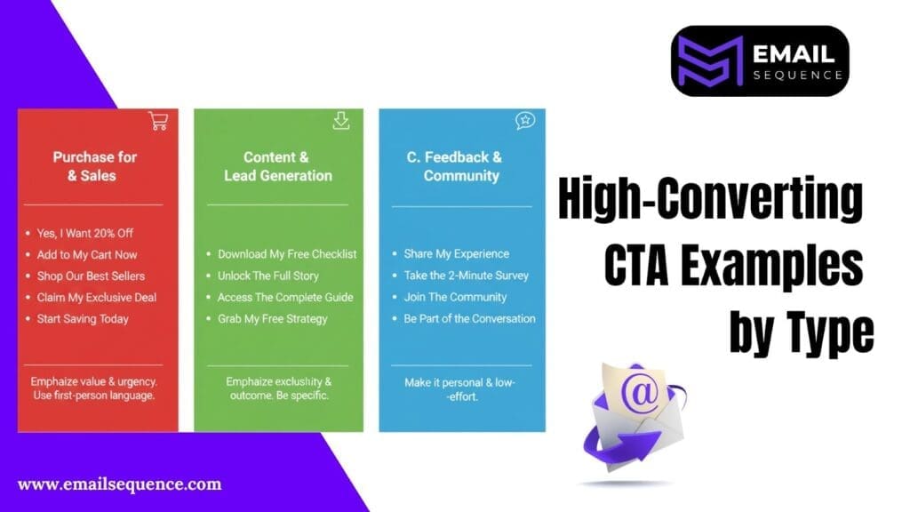
A. CTAs for Encouraging Purchase & Sales
Sales-focused CTAs must emphasize the value of the purchase and reduce friction. The goal is to make the decision feel easy and beneficial.
What makes a purchase CTA effective? It removes doubt, highlights the benefit, and creates urgency when appropriate.
- “Yes, I Want 20% Off”
- “Add to My Cart Now”
- “Shop Our Best Sellers”
- “Claim My Exclusive Deal”
- “Unlock My Discount Before It Expires”
- “Start Saving Today”
Sales CTAs often benefit from first-person language and urgency triggers, a key characteristic of High-Converting Email CTAs. “Yes, I Want 20% Off” is more compelling than “Get 20% Off” because it frames the action as a personal decision.
B. CTAs for Content & Lead Generation
Content-focused CTAs must emphasize the value of the resource and make the download feel exclusive or actionable.
What separates a high-performing content CTA from a generic one? Specificity and outcome focus. The reader should know exactly what they are getting and why it is valuable.
- “Download My Free Checklist”
- “Unlock Insider Tips”
- “See The Full Story”
- “Access The Complete Guide”
- “Grab My Free Template”
- “Reveal The Strategy”
Content CTAs work best when they use words like “unlock,” “reveal,” or “access” to imply exclusivity. These words suggest that the content is valuable and not available to everyone.
C. CTAs for Feedback & Community
Feedback and community-focused CTAs must feel personal and low-effort. The goal is to encourage participation without creating friction.
How do you write a CTA that makes people want to share their opinion? Make it easy, personal, and rewarding.
- “Share My Experience”
- “Take the 2-Minute Survey”
- “Join The Community”
- “Tell Us What You Think”
- “Help Us Improve (It Takes 60 Seconds)”
- “Be Part of the Conversation”
Feedback CTAs benefit from time estimates and personal language. “Take the 2-Minute Survey” is more effective than “Complete Survey” because it reduces perceived effort.
Pillar 3: The Visual Command | Design and Placement of CTA
Design determines whether your CTA gets noticed. Psychology determines whether it gets clicked. Both are necessary.
A well-designed CTA stands out from the rest of the email, draws the reader’s eye, and makes the action feel simple and accessible. A poorly designed CTA blends into the background, gets overlooked, or creates friction.
The following design principles apply to every type of email campaign.
A. The Visual Hierarchy: Contrast and White Space
Contrast is the most important design principle for CTAs. Your button must stand out from the rest of the email.
How do you create visual contrast? Use a bold color that contrasts with your email background and ensure that your CTA button is surrounded by white space.
White space is not wasted space. It is the visual breathing room that allows your CTA to command attention. If your CTA is surrounded by text, images, or other design elements, it will get lost.
Best practices for visual hierarchy:
- Use a high-contrast button color that aligns with your brand but stands out from the email background.
- Surround your CTA with at least 20-30 pixels of white space on all sides.
- Avoid placing multiple CTAs near each other. If you need multiple CTAs, space them out vertically.
B. Strategic Placement: Above the Fold vs. Repetition
Placement depends on email length and complexity. Short emails benefit from a single, prominent CTA above the fold. Longer emails benefit from repeating the CTA two to three times throughout the message.
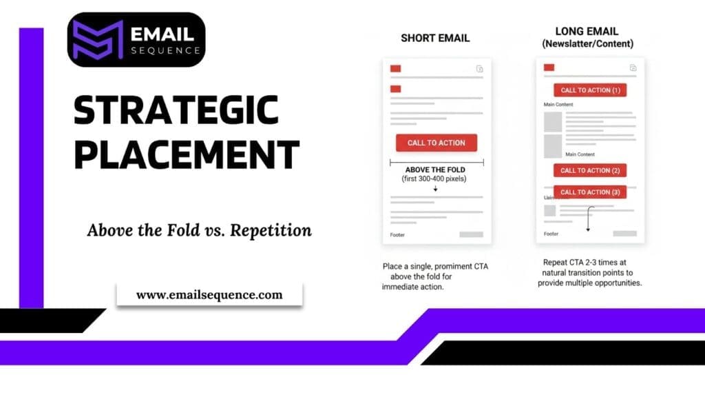
What does “above the fold” mean in email? It refers to the portion of the email that is visible without scrolling. For most email clients, this is approximately the first 300-400 pixels.
- For short promotional emails, place your primary CTA above the fold. This ensures that readers see the action immediately without needing to scroll.
- For longer emails (such as newsletters, product launches, or educational content), repeat the CTA at natural transition points.
- Place the first CTA early in the email, the second CTA after the main content, and the third CTA at the end.
Why does repetition work? Not every reader will be ready to click the first time they see your CTA. Repeating the CTA gives readers multiple opportunities to take action without feeling repetitive or pushy.
C. The Mobile Requirement (The 44×44 Rule)
Mobile devices account for more than 50% of email opens. If your CTA is not optimized for mobile, you are losing clicks.
The 44×44 rule is a mobile design standard. Your CTA button must be at least 44 pixels wide and 44 pixels tall to ensure easy thumb-tapping on mobile screens. Smaller buttons create friction and reduce click-through rates.
Additional mobile optimization tips:
- Use a single-column email layout to ensure your CTA is centered and easy to tap.
- Test your email on multiple mobile devices to verify button size and placement.
- Avoid placing multiple buttons side-by-side, as this creates tap errors on mobile screens.
Mobile optimization is not optional. If your CTA is difficult to tap on a mobile device, you are losing a significant portion of potential clicks.
The Architectural Approach to Testing with EmailSequence.com
The most successful email marketers do not rely on best practices alone. They test variations, measure results, and deploy winners. This is the difference between good CTAs and great CTAs.
A. Beyond Single-Email Testing: The Sequence Advantage
Most email platforms allow you to A/B test individual emails. But single-email testing has limitations when it comes to understanding what makes for truly High-Converting Email CTAs. If you test a CTA in one promotional email, you learn what works for that specific campaign. You do not learn what works across your entire email strategy..
Why does sequence-level testing matter?
Automated email sequences generate revenue 24/7. A 2% improvement in CTR for a welcome sequence that runs continuously translates to thousands of additional clicks and conversions over time.
EmailSequence.com is built for sequence-level optimization. It allows you to test CTA variations across entire email flows, automatically identify the winning version, and deploy it permanently without manual intervention.
B. The Critical CTA A/B Testing Variables
Not all CTA elements are worth testing. Focus on the variables that have the greatest impact on click-through rates.
What should you test first? The following four variables consistently produce the largest differences in performance:
- Voice (First-Person vs. Second-Person): Test “Start My Free Trial” vs. “Start Your Free Trial.” First-person language typically outperforms second-person language, but the difference varies by audience.
- Color: Test high-contrast colors that align with your brand. The best-performing button color depends on your email design and audience preferences.
- Wording (Benefit-Focused vs. Action-Focused): Test “Unlock The 7-Step Playbook” vs. “Download The Playbook.” Benefit-focused CTAs typically generate higher CTRs, but action-focused CTAs may perform better for time-sensitive offers.
- Placement (Above the Fold vs. Below the Fold): Test CTA placement for longer emails. Some audiences respond better to early CTAs, while others prefer to read more content before clicking.
Final Thoughts
CTAs are the lifeblood of your email strategy. The difference between a 2% and 10% click-through rate can dramatically impact your revenue. High-converting CTAs aren’t accidental; they stem from understanding user psychology, applying sound design principles, and rigorous A/B testing.
Start by auditing your existing CTAs. Replace generic calls with benefit-focused, first-person language. Experiment with color, placement, and wording variations. Measure performance and implement the winning designs.
Ready to boost your email optimization? EmailSequence can elevate your CTA testing. Our platform automates A/B testing across entire email flows, pinpoints top-performing variations, and deploys them for continuous revenue generation. Stop missing clicks and start optimizing your emails today.
Frequently Asked Questions
What is the best CTA for email?
The best Call-to-Action (CTA) is contextual, benefit-driven, and specific to the recipient’s stage in the journey. Avoid generic phrases like “Click Here” or “Submit.” Instead, use direct, compelling action verbs combined with a clear promise of value.
What defines a high-converting email?
A high-converting email is a well-structured message that prioritizes clarity, relevance, and a single, obvious goal. It ensures recipients can quickly grasp the core value proposition and immediately identify the next step. Poorly designed emails, by contrast, feature unclear messaging, overwhelming graphics, and low-contrast CTAs that lead to confusion and lost conversions.
What is the ideal email click-through rate for marketers?
Aim for a 10% or higher CTR. Anything above 5% shows solid engagement, but 10%+ signals high-performing CTAs and strong audience connection.
What color buttons get the highest CTR in emails?
High-contrast colors like orange, green, or blue often perform best. Choose a button color that stands out from your email background.
Do colors like red or green really affect CTA performance?
Yes. Color psychology impacts perception. Red triggers urgency, while green signals go or success. You can test both for your audience.
What are the most effective high-converting CTA examples?
Effective CTAs use urgency, exclusivity, or curiosity:
For Sales:
- “Yes, I Want My {20% Off”
- “Unlock My Discount Before It Expires”
- “Shop Our New Drop”
For Content/Lead Gen:
- “Reveal the 3 Secret Strategies”
- “Access the Full 7-Step Guide”
For Abandoned Cart:
- “Take Me Back to My Cart”
- “Complete My Order Now”
- “Finish My Purchase & Save”
What is the 60/40 rule in email design?
The 60/40 rule is a guideline for text-to-image ratio, recommending that your email body should contain a minimum of 60% text and a maximum of 40% image content
What are the 5 Cs of an effective email CTA?
Ensure your CTA meets these 5 critical criteria to maximize your conversion potential:
- Contextual: The CTA must align perfectly with the email content’s promise.
- Clear: Use unambiguous language that states the action and the result.
- Compelling: Utilize a psychological trigger (Urgency, Curiosity, or Reward).
- Conspicuous: The CTA button must stand out visually using high contrast and white space.
- Concise: Use short, powerful, and easy-to-read wording.