Email Header Design: A Guide to Higher Conversions
Effective email header design creates the first visual impression, establishes trust, guides attention, and dictates whether subscribers read your message. High-converting headers combine clear visual hierarchy, optimized preheader text, and strategic above-the-fold content to drive immediate action.
When marketers prioritize header optimization over basic branding, they generate higher engagement, secure better click-through rates, and achieve stronger campaign performance. Do not treat the header as mere decoration; treat it as your most critical conversion asset.
The First 3 Seconds: Why Most Email Headers Fail Immediately
Effective email header design starts with attention psychology, not just design theory. Subscribers decide whether to read your message within the first three seconds of opening it.
Subscribers Scan Before They Read
Email readers move fast. They look for relevance, trust, and a clear reason to continue.
The inbox already trains users to make quick decisions. Mailchimp explains that the inbox view usually shows the sender name, subject line, and preheader text, which gives users only a brief preview before opening.
A strong header must answer three questions quickly:
- Who sent this? The sender and brand must look familiar.
- Why should I care? The headline must show a clear benefit.
- What should I do next? The CTA path should feel obvious.
- Is this relevant to me? The message should match the user’s need.
- Can I trust this? The design should feel clean, branded, and credible.
When the header answers these questions fast, the rest of the email gets a better chance.
Visual Clutter Kills Engagement
Too many elements at the top of an email overwhelm the reader. When you place social media icons, secondary links, massive logos, and navigation bars together, you create conflicting messages.
Decision fatigue sets in instantly when users do not know where to look or what to click. A successful email header design removes friction by presenting a single, clear path for the eye to follow.
The Header Determines Whether the Rest Gets Seen
The email body may include the best offer, product, case study, or content link. The reader will not see it if the header fails.
The header works like a doorway. It does not need to explain everything, but it must create enough trust and curiosity to move the reader forward.
The Real Job of an Email Header
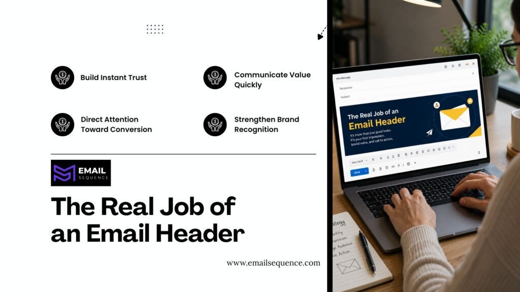
Most people mistakenly think headers act only as branding tools. You must understand that their primary role is guiding user action and driving conversions.
Build Instant Trust
Your subscribers get dozens of promotional emails daily. A professional email header design builds immediate brand recognition, reassuring the user that the message is legitimate and safe. This instant trust is key to getting them to engage further.
Consistency across your campaigns builds a reliable expectation that increases long-term engagement.
Communicate Value Quickly
Message clarity determines whether the subscriber stays or leaves. Your design must position the offer clearly before the user even considers scrolling.
When you match reader expectations with a clear value proposition, you increase the likelihood of a conversion. Do not hide your main point in the third paragraph; put it right at the top.
Direct Attention Toward Conversion
Strategic visual flow forces the reader to look exactly where you want them to look. You prepare the user for the call to action (CTA) by organizing elements logically.
Good visual hierarchy ensures the reader naturally progresses from the logo to the headline to the main button without distraction.
Header Optimization Starts Before the Email Is Opened
You must connect the inbox experience directly with the opened email performance. Header optimization begins before the user even clicks your subject line.
Subject Line and Header Must Work Together
The subject line should create the open. The header should confirm the promise after the open.
Subject lines should stand out and stay true to the email content because they help bring emails directly to the customer base.
A strong subject-header match looks like this:
- Subject line: “Your 5-step cold email checklist”
- Preheader: “Use this before launching your next campaign.”
- Header headline: “Launch Cleaner Cold Email Campaigns in 5 Steps”
This creates message continuity.
Visual Hierarchy: The Secret Behind High-Converting Email Headers
This is where your email header design can separate a generic campaign from a high-performing one. You must master attention management to guide the reader successfully.
How the Human Eye Scans Email Content
Readers typically follow an F-pattern behavior when viewing content on desktop screens. They read across the top, scan down the left side, and read across again. Mobile scanning patterns differ slightly, favoring a straight vertical scroll.
Understanding this reading flow allows you to place crucial information exactly where the eye naturally lands.
Creating a Clear Attention Path
A clear attention path means the reader never wonders where to look. The layout should move the eye from the main message to the CTA.
Use size, spacing, alignment, contrast, and placement to create that path.
A big headline with a tiny CTA creates friction. A beautiful image with a hidden headline creates confusion.
Prioritizing One Primary Goal
You must avoid competing calls to action at the top of your message. Simplifying decisions increases the conversion rate. When you present only one primary goal, the reader knows exactly what you expect them to do. Multiple buttons or links dilute focus and reduce overall clicks.
Above-the-Fold Content: Winning Before the Scroll
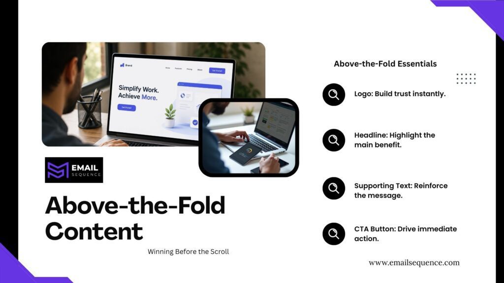
The area visible before scrolling remains one of the most critical conversion sections in any campaign. You must optimize above-the-fold content to maximize success.
What Users Should See Immediately
The value proposition must dominate the top section of the screen. A strong headline should immediately communicate the primary benefit to the reader. Trust indicators, such as recognized brand colors or a clean logo, reassure the user.
Every element of your above-the-fold content must serve the goal of keeping the reader engaged.
Why Mobile Above-the-Fold Matters More Than Desktop
Mobile users see less content at once. A desktop header may show the logo, headline, image, and CTA together, while mobile may show only the logo and part of the hero image.
Litmus tracks email client market share across major inbox environments and shows why teams must design for real client behavior instead of assuming one desktop layout will work everywhere.
Mobile-first header design protects the first impression.
The Ideal Above-the-Fold Structure
A structured approach prevents clutter and ensures maximum readability. You must organize the layout to guide the reader seamlessly from recognition to action.
The most useful points include:
- Brand Logo: Place a reasonably sized logo at the top center or left to establish immediate trust.
- Main Headline: Write a clear, benefit-driven headline that matches the subject line.
- Supporting Text: Add one short sentence that elaborates on the headline’s promise.
- Primary Button: Include a highly visible, contrasting CTA button that drives the main goal.
Header Images: When They Help and When They Hurt Conversions
Visuals can enhance your message or completely distract from it. You must understand how to use header images strategically.
The Purpose of Header Images
Visual storytelling connects the reader to your product emotionally. Reinforcing the message with relevant header images helps users understand the value faster than text alone. The right image supports the copy and pushes the reader toward the call to action.
Common Header Image Mistakes
Using generic stock photos damages your brand credibility immediately. Irrelevant visuals confuse the reader and disrupt the message continuity. Oversized graphics push the actual text and buttons down below the scroll line, destroying your conversion chances.
High-Converting Image Strategies
You must choose visuals that actively support the conversion goal. Product-focused visuals show the user exactly what they will get. Contextual imagery places the product or service in a relatable scenario.
Conversion-oriented design ensures the image directs the eye toward the CTA rather than away from it.
Designing Email Headers for Mobile Users First
Modern campaigns require a strict mobile-first methodology, and this is especially true for email header design. You must design for the smallest screen first before adapting to a desktop.
Why Mobile Dominates Email Engagement
Device usage statistics prove that smartphones generate the vast majority of opens. User behavior trends indicate that people check emails while commuting, waiting in line, or relaxing at home. If your design fails on mobile, it fails entirely.
Mobile Header Design Best Practices
Scaling elements correctly ensures a smooth user experience. You must optimize fonts, buttons, and graphics for finger-tapping and small screens.
The most useful points include:
- Font Sizing: Use a minimum of 16px for body text and 22px for headlines to ensure easy reading.
- Button Spacing: Create ample clickable space around buttons to prevent accidental clicks on the wrong links.
- Image Scaling: Code images to resize automatically so they never stretch or break the layout on smaller screens.
Responsive Design Considerations
Device adaptability ensures your layout looks perfect regardless of the screen size. A consistent experience builds trust and keeps readers engaged. You must use responsive templates that automatically adjust to the user’s specific device.
Conversion-Focused Header Layouts That Consistently Perform
Do not reinvent the wheel every time you create a campaign. You must use proven frameworks to achieve reliable results.
Promotional Campaign Header Layout
Product launches require high energy and immediate focus on the item. Limited-time offers need a prominent countdown timer or urgency statement right at the top. The layout must prioritize the product image and the discount.
Newsletter Header Layout
A content-first structure works best for informational emails. Reader engagement relies on a clean, minimal top section that highlights the main article or topic. You want to pull the reader into the story immediately.
SaaS and B2B Header Layout
Lead generation campaigns demand extreme clarity. Demo requests should sit prominently in the top section. You must focus on the business value proposition rather than flashy graphics.
E-commerce Header Layout
Revenue generation drives e-commerce layouts. Product emphasis is crucial. You must showcase high-quality product imagery alongside a clear “Shop Now” button to capture impulse clicks.
Here is a breakdown of how different layouts serve specific marketing goals. This table will help you choose the right framework for your next campaign.
| Header Layout Type | Primary Goal | Best For | Key Visual Element | Expected Action |
| Promotional | Drive immediate sales | Retail, E-commerce | Product photo + Discount | Click to buy |
| Newsletter | Build authority | Media, SaaS, Creators | Minimal logo + Article title | Scroll and read |
| B2B Lead Gen | Capture contact info | Agencies, SaaS | Value proposition text | Click to form |
| Event Invite | Drive registrations | Webinars, Live events | Speaker photo + Date/Time | Click to register |
| Transactional | Deliver information | Receipts, Shipping | Clear status update | Save or click tracking |
Psychological Triggers That Increase Header Engagement
To grab attention and drive action, your email header design must do more than just look good; it needs to leverage human psychology.
Curiosity
Information gaps compel the human brain to seek answers. Attention generation occurs when your headline teases a solution without giving everything away. You must make the reader want to click to satisfy their curiosity.
Relevance
Audience alignment ensures the reader feels understood. Personalization techniques, like using the subscriber’s name or referencing past purchases, increase relevance. When the message feels personal, engagement rises.
Trust Signals
Credibility indicators remove fear and hesitation. Social proof, such as star ratings or customer counts, reassures the reader. You must show the user that others trust your brand.
Clarity
Simple messaging always beats clever copy. Reduced confusion leads directly to higher conversion rates. You must state exactly what you offer and what the user needs to do next.
Conclusion
Strong email header design helps subscribers understand your message quickly, trust your brand, and move toward the main CTA. The header should not carry clutter, vague copy, or image-only messaging. It should create a clear attention path from brand recognition to value to action.
The best headers combine subject line alignment, strong preheader text, above-the-fold clarity, mobile-first layout, relevant images, and psychological triggers. Better header optimization improves the chance that subscribers read the email, click the CTA, and convert. For more insights on creating powerful email campaigns, visit our website.
Frequently Asked Questions
What is the ideal size for an email header?
The ideal width for most templates is 600 pixels. Keep the height between 70 and 200 pixels to ensure the primary message and button remain visible as above-the-fold content on mobile devices.
Do I always need to include an image at the top?
No, you do not always need header images. While they work well for e-commerce, B2B or newsletter campaigns often perform better with text-based designs that prioritize fast loading times and immediate reading.
How does preheader text affect the overall design?
Preheader text acts as the crucial bridge between the subject line and the opened email. Optimizing this text increases open rates, ensuring that more users actually see the email header design you created.
What is the biggest mistake marketers make with the top of their emails?
The biggest mistake is destroying visual hierarchy by cramming too many links, logos, and social icons at the top. This creates visual clutter and distracts the reader from the primary conversion goal.
How do I ensure my design works on mobile devices?
You must adopt a mobile-first approach. Use large, legible fonts, create highly contrasting CTA buttons, and ensure all above-the-fold content stacks vertically so the user does not have to zoom or scroll horizontally.