Email Landing Page Optimization: The Ultimate Guide to CRO
You’ve poured hours into creating the perfect subject line. Your email list is expertly segmented. The design? Absolutely stunning. But then, the moment your subscribers click through, crickets. Sound familiar? The issue isn’t your email; it’s what’s waiting for them on the other side.
Email campaigns succeed or fail based on the post-click experience. While getting a click is a victory, it is only the first step. The real work happens when your subscriber lands on your site. If that destination is confusing, cluttered, or mismatched with your email’s promise, you lose the conversion.
This guide explores email landing page optimization in depth. We will examine how to align your messaging, design high-converting layouts, and refine your forms to ensure your email traffic turns into measurable revenue.
What Is Email Landing Page Optimization?
Email landing page optimization is the process of improving the design, content, and functionality of a webpage specifically to increase the percentage of email visitors who complete a desired action.
Here’s a breakdown of how landing page optimization differs from general landing page optimization:
- Specific Expectations: Visitors from an email campaign arrive with expectations set by your email copy. For example, if your email offers a 20% discount on winter coats, the landing page must prominently feature that same offer and product category.
- Warm Audience: Email traffic comes from a “warm” audience that has already engaged with your brand. Your optimization strategy should leverage this existing interest.
- Targeted Messaging: Unlike general landing pages that cater to broad search intent, email landing pages should have a focused message that directly reinforces the specific offer that prompted the click.
- Reduced Friction: The primary goal is to remove any barriers between the user and the desired action, making the conversion path as smooth as possible.
Why You’re Losing Conversions After the Click
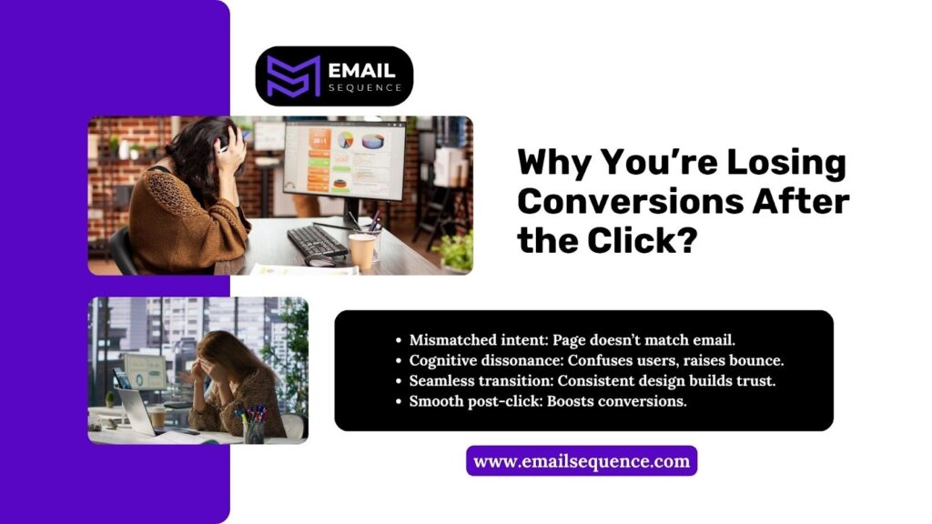
Why do so many campaigns see high click-through rates but low conversion rates? The disconnect often stems from a jarring post-click experience.
User Intent and Expectation:
When users click a link, they bring specific intent and expectations. If the landing page doesn’t align with the email or fails to deliver on the promise, users feel confused and might leave immediately.
Cognitive Dissonance:
A mismatch between the email and the landing page creates cognitive dissonance. This confusion or sense of being misled leads to higher bounce rates.
Seamless Transition Builds Trust:
Consistency in design, tone, and offer ensures the landing page feels like a natural continuation of the email. This “continuity effect” reassures users they are in the right place.
The Importance of the Post-Click Experience:
Prioritizing a smooth post-click experience validates the user’s decision to click. A well-aligned experience significantly boosts the chances of conversion.
Why it Matters:
A consistent and seamless experience from email to landing page builds trust and reduces confusion. Users are more likely to stay, engage, and convert when their expectations are met, making it a critical factor in optimizing your marketing funnel.
Understanding Conversion Funnels for Email Traffic
The journey from an inbox to a purchase involves distinct psychological stages. Understanding this conversion funnel is essential for effective optimization.
Typical stages of the funnel after the click include:
- Awareness: The user lands on the page and orients themselves.
- Interest: They scan the headline and visuals to confirm relevance.
- Desire: They read the benefits and social proof, building motivation.
- Action: They complete the form or purchase.
Email traffic differs from organic search or social media traffic. These users are pre-qualified. They already know your brand and have demonstrated interest by opening and clicking your email. Your landing page does not need to start from scratch; it needs to facilitate the final steps of the funnel efficiently.
Landing Page Design Elements That Boost Conversions
Great design is not just about aesthetics; it is about directing user behavior. To maximize conversions, every visual element must serve a purpose.
Above-the-Fold Clarity
The moment a user lands on your page, they should know exactly what you offer. The area visible without scrolling—”above the fold”—is prime real estate.
Ensure your headline matches the language used in your email. If the email button said “Get Your Free E-book,” the landing page headline should not say “Subscribe to Our Newsletter.” It should explicitly confirm the e-book download. A supporting subheadline can reinforce the value proposition, ensuring clarity within seconds.
Visual Hierarchy
A strong visual hierarchy is key to guiding a visitor through your landing page. By strategically using size, color, and placement, you can direct attention to the most important elements, leading them naturally toward the call to action.
Here’s how to create an effective visual hierarchy:
- Use whitespace: Give your content room to breathe. Generous whitespace separates sections and makes your page easier to read.
- Emphasize key elements: Make your headline, key benefits, and call to action stand out using bold text, larger fonts, or contrasting colors.
- Avoid clutter: If too many elements compete for attention, your main message will be lost. Prioritize what you want the user to see first, second, and third.
Trust Signals
Before a visitor shares their personal information or payment details, they need to feel safe. Trust signals provide this reassurance, reducing anxiety and making it easier for them to convert.
- Incorporate testimonials, security badges, and partner logos.
- Use relevant social proof. For example, if you’re promoting a webinar, show reviews from past attendees.
- Prove that others have taken the action safely and benefited. This builds confidence and encourages new users to follow suit.
Responsive & Accessibility
If your landing page is difficult to navigate on a smartphone, you will lose conversions. Ensure buttons are large enough to tap with a thumb. Fast loading times are non-negotiable; mobile users are notoriously impatient. Accessibility ensures all users, including those using screen readers, can navigate your page and complete the goal.
Call-to-Action (CTA) Optimization
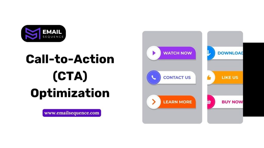
The Call-to-Action is the tipping point of your campaign. Your CTA button must be impossible to miss. Use a color that contrasts sharply with the background. The text on the button matters immensely. Avoid generic phrases like “Submit.” Instead, use benefit-driven language like “Get My Free Guide” or “Start My Trial.”
CTA placement and design are critical components of your conversion strategy. To ensure your call-to-action drives results, follow these optimization steps:
- Priority Placement: Position your primary CTA “above the fold” so users can act immediately without scrolling.
- Logical Flow: For longer pages, repeat CTAs after high-value sections to capture users exactly when they are most convinced.
- White Space: Surround your CTA with ample white space to prevent visual clutter and draw the eye directly to the button.
- Benefit-Led Copy: Replace “Click Here” with action-oriented phrases that highlight the payoff, such as “Boost My Traffic” or “Claim My Discount.”
Micro-commitments can also significantly reduce friction. Instead of pushing for a high-stakes purchase immediately, ask for a smaller step like “See the Collection” or “Check Availability.” This small initial “yes” builds momentum, making the final conversion much easier to obtain.
Form Optimization for Conversions
Forms are necessary hurdles, and your goal is to lower the bar so users can glide through. By reducing friction and simplifying the data collection process, you transform a potential point of abandonment into a seamless gateway for your customers.
To optimize your forms for maximum conversions, focus on these key strategies:
- Minimize Fields: Ask only for the essentials; if you only need an email address, don’t ask for a phone number or job title.
- Inline Validation: Help users correct errors in real-time to avoid the frustration of a failed submission after they hit “send.”
- Clear Labeling and Progress Cues: Use straightforward labels and indicators like “Step 1 of 2” to manage expectations and reduce cognitive load.
- Smart Features: Implement autofill and smart defaults to streamline the process, making completion feel almost effortless.
Content Optimization: Messaging & Relevance
A key aspect of Email Landing Page Optimization is ensuring your copy echoes the voice of your email. This alignment reinforces the message and keeps the user engaged. If your email used a casual, humorous tone, a stiff, corporate landing page will feel jarring. This is known as cognitive dissonance.
To further optimize your content for relevance, use dynamic content:
- Personalize Headlines and Offers: If you can identify a visitor as a returning customer, tailor the headline or offer specifically for them.
- Address User Context: Personalizing the content shows you understand the user’s needs and where they are in their customer journey, which increases engagement.
Analytics & Key Metrics for Landing Page CRO
Your decisions must be driven by data. Without tracking the right metrics, you’re essentially optimizing in the dark. Implementing a robust analytics setup is the first step toward understanding user behavior and identifying areas for improvement.
Essential KPIs include:
- Conversion Rate: The percentage of visitors who complete the goal.
- Bounce Rate: The percentage of visitors who leave without interacting.
- Time on Page: Indicates engagement level.
- Scroll Depth: Shows how much of your content is actually seen.
Analyze click-through paths to see where users go if they do not convert. This data reveals bottlenecks and opportunities for further refinement in your email landing page optimization strategy.
Landing Page Examples that Convert
Studying successful pages can help you see these concepts in action. Here are a couple of landing page examples that do a great job of converting visitors.
Example 1: The Focused Lead Magnet
This type of page is designed with one goal: to get the user’s contact information in exchange for a valuable resource (like an ebook or webinar).
- No navigation bar: This removes potential exit routes, keeping the visitor focused on the offer.
- Matching headlines: The headline on the landing page directly mirrors the email subject line, creating a consistent and reassuring user journey.
- Simple forms: The form only asks for essential information, like a name and email address. This reduces friction and makes it easier for users to sign up.
- Tangible visuals: The page features an image that represents the digital download (e.g., a mockup of the ebook cover), making the offer feel more concrete. This approach is centered on form optimization to maximize conversions.
Example 2: The E-commerce Product Page
This page is built to drive sales by showcasing a product and making the purchase process as smooth as possible.
- Strong trust signals: Customer reviews, security badges, and satisfaction guarantees are placed prominently, often right below the “Add to Cart” button, to build confidence.
- High-quality visuals: The page uses professional product photos and videos from multiple angles to give the user a clear sense of what they’re buying.
- Clear pricing: The cost, including any discounts or shipping fees, is displayed upfront to avoid surprises.
- Sticky CTA placement: The “Add to Cart” button remains visible on the screen as the user scrolls. This sticky placement reduces friction, ensuring the call-to-action is always accessible when they decide to buy.
Conclusion
Email landing page optimization is the lever that turns traffic into value. By aligning your message, simplifying your design, and rigorously testing your elements, you create a seamless journey for your subscribers.
Don’t let a great email campaign die on a mediocre landing page. Focus on the post-click experience. Refine your conversion funnel. Test your landing page design. When you respect the continuity between the inbox and the browser, you build trust and drive sustainable growth.
Ready to turn your clicks into conversions? Visit emailsequence.com to discover how our expertise can supercharge your landing pages and unlock sustainable growth.
Frequently Asked Questions (FAQs)
What is email landing page optimization?
Email landing page optimization is the practice of refining a specific webpage to maximize the number of email visitors who take a desired action, ensuring the page aligns perfectly with the email campaign’s promise.
How does post-click experience affect conversions?
The post-click experience determines whether a user trusts your offer. A seamless, relevant experience reduces bounce rates and encourages action, while a disjointed experience causes confusion and abandonment.
What elements should be prioritized on landing pages?
You should prioritize a clear headline, a compelling Call-to-Action (CTA), a landing page design that directs attention, and social proof. These elements are critical for immediate engagement.
How can I improve CTA performance on my landing pages?
Optimize CTAs by placing them above the fold, using contrasting colors, benefit-driven copy, repeating them strategically, and incorporating micro-commitments to reduce friction.
How many form fields should I include for optimal conversions?
Only ask for essential information. Shorter forms (1–3 fields) reduce friction and increase the likelihood that visitors will complete the desired action.